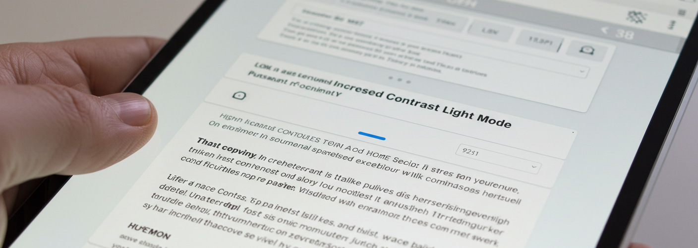

In the digital age, we spend a significant amount of time interacting with screens, whether it’s for work, study, or leisure. As a result, the comfort and clarity of our viewing experience have become paramount. One common challenge many users face is the strain caused by low-contrast light modes that can lead to eye fatigue and discomfort. This article delves into the concept of increased contrast light mode, a solution that enhances visibility without sacrificing the aesthetic appeal of light mode interfaces.
Light mode, characterized by a white or light background with darker text, has long been a popular choice. However, many find it challenging to read due to the stark brightness and low contrast. This experience can be particularly troublesome for those sensitive to bright lights or with visual impairments. The standard light mode typically uses a high level of brightness and may lack sufficient differentiation between text and background colors. As a result, users can find it difficult to focus on the content, leading to eye strain and headaches.
Increased contrast light mode offers an innovative adjustment to this issue. By elevating the contrast between text and background, this mode enhances readability significantly. For instance, instead of a stark white background, an off-white or very light gray can be paired with slightly darker text colors. This modification reduces the intensity of brightness while improving the visual separation of elements on the screen. Such changes allow users to engage with their content more comfortably.
It is crucial to distinguish increased contrast light mode from general accessibility features often integrated into operating systems and applications. Accessibility features may adjust various elements of the entire interface, including icons and window borders, catering to a broader range of user needs. In contrast, increased contrast light mode focuses solely on enhancing textual and graphical clarity, ensuring that users can still enjoy the light mode experience without overwhelming their eyes.
Furthermore, this improvement can be beneficial in various contexts, from coding and writing to reading and browsing. In spaces like offices or schools where bright overhead lights are common, a high-contrast light mode can reduce glare and make prolonged use more pleasant. Users can work more efficiently and with less discomfort, freeing them from frequent breaks and allowing for deeper concentration.
The potential applications for increased contrast light mode extend beyond individual preference. Designers and developers can adopt this feature in their applications and websites, creating an inclusive environment for all users, especially those who may encounter challenges with conventional light modes. Testing usability with diverse user groups can provide invaluable insights, ensuring that increased contrast settings are widely beneficial.
In conclusion, embracing increased contrast light mode presents a practical solution for users struggling with visibility in traditional light mode settings. By enhancing contrast and improving clarity, we pave the way for a more comfortable digital experience. As we advocate for better design practices in technology, it is essential to explore options like increased contrast light mode that cater to our diverse user community. Adopting such features wisely can enhance productivity and well-being in our increasingly screen-centric world.


Add comment