In recent years, Microsoft has made significant strides in enhancing the user experience with its Windows operating system. Among these advancements, the introduction of the overflow menu in the Windows 11 taskbar has sparked quite a discussion. This feature, initially designed to streamline the taskbar and manage space more efficiently, has been both praised and criticized by users. While the innovation behind the overflow menu is commendable, many users feel it has ultimately created more problems than it solves.
The overflow menu is intended to help users manage their open applications more effectively when screen real estate is limited. We can appreciate the creativity that went into designing a feature that is supposed to consolidate open windows without cluttering the taskbar. However, as with many new features, this one has led to unintended consequences.
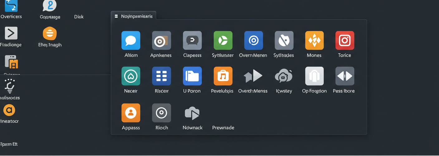
For a start, the overflow menu obscures open applications. Instead of seeing all your active windows at a glance, let’s say you initially launched five programs. But as you open more, those that exceed the taskbar’s visible capacity are shoved into the overflow menu, which requires an extra click to access. This additional step may sound trivial, yet it disrupts the flow of work and can hinder productivity, particularly for users who rely on multitasking.
Moreover, the usability of the overflow menu hinges significantly on how quickly users can learn to navigate it effectively. While some users may adapt rather quickly, others may find it alienating. The inconsistency of experience as people either enjoy the streamlined interface or feel frustrated by the extra clicks creates a divide among users. For individuals who prefer a more traditional setup, the absence of a straightforward view of all open applications adds to the confusion.
This has led many to call for a return to a more traditional taskbar setup—specifically, the option of having an additional row for icons. An extra row for taskbar apps would allow users to see all their applications in one glance without needing to sift through nested menus. The simplicity of a multi-row taskbar is a significant feature that has been missed by many seasoned Windows users who were accustomed to older iterations of Windows.
In addition, having the capability to customize the taskbar to accommodate user preferences fosters a sense of control. Users can already modify so many other aspects of their UI; why not extend that to the taskbar? The taskbar can be a significant part of an efficient workflow; thus, providing options to adapt it as per individual needs would genuinely enhance the overall user experience.
Many users believe that the taskbar’s primary function is clear visibility and instant accessibility. Therefore, bringing back an option for an extra row in the taskbar could eliminate the hassle of an overflow menu and would likely resonate well with the broader windows community.
In conclusion, while the ingenuity behind the overflow menu in Windows 11 is evident, it is essential to consider user feedback regarding functionality and accessibility. Perhaps the best solution is to strike a balance between modernity and the usability that long-time Windows users crave by offering multiple taskbar configurations. Ultimately, adaptability and user preference should guide future updates to enhance productivity and satisfaction among all Windows users.


Add comment