
Disorienting UI Changes: The Centered Search Bar Dilemma
In the ever-evolving world of software and user interfaces, changes are often necessary to improve functionality and user experience. However, certain modifications can lead to confusion and frustration among users, especially when they disrupt established habits. A recent update that has introduced a centered search bar text field has sparked discussions among users, with many feeling mildly disoriented by this shift in design.
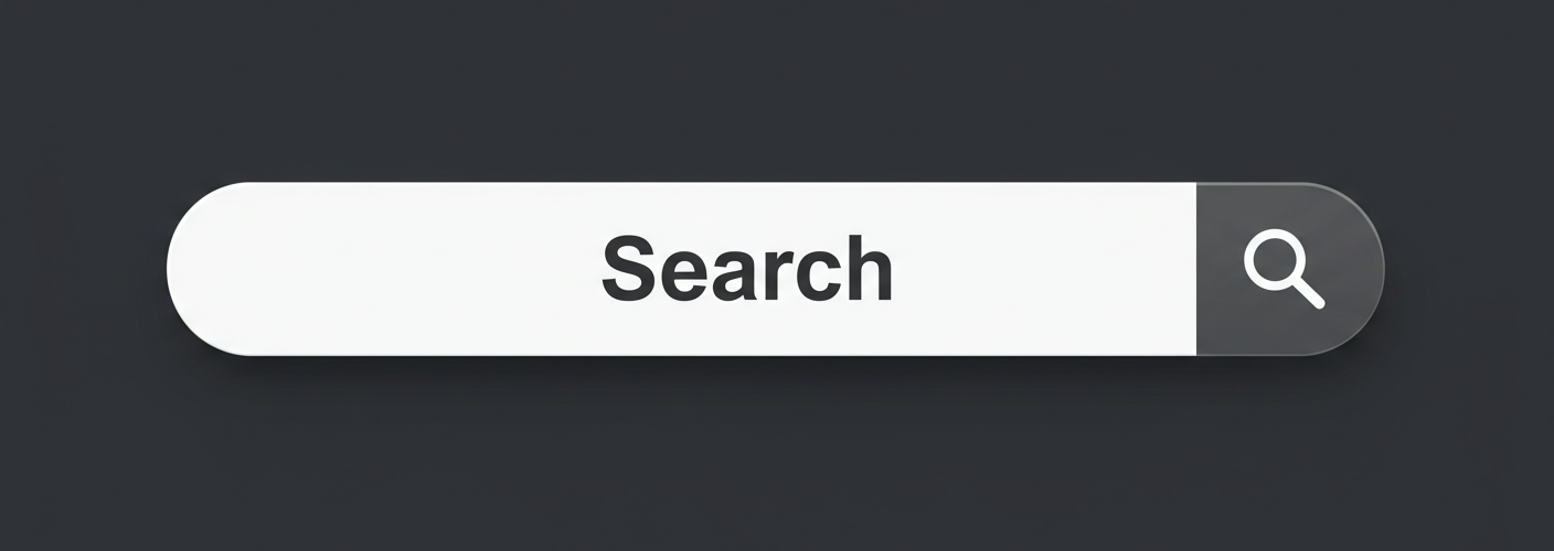
A few users have taken to forums and social media platforms to express their concern over this seemingly minor yet impactful change. The primary observation is that the search bar, which many users believed was traditionally left-aligned, is now centered. This alteration, while perhaps done in an attempt to modernize the aesthetic or adhere to design trends, has left some feeling that it detracts from the overall user experience.
For those accustomed to a left-aligned search bar, the sudden transition can feel janky or buggy. Experienced users often find user interfaces by their layout—when features shift unexpectedly, it can disrupt the familiarity and ease of use that many have come to rely on. The centered search bar may create a visual imbalance, especially since other elements in the interface remain left-aligned.
Moreover, this issue isn’t isolated to just one feature; users have noted changes in other instances, such as the search bar in Settings also appearing centered. This has led some to question if the design change was intentional or a bug that went unnoticed during testing. The inability to find a suitable “Bug” flair on forums for reporting this issue has created further confusion about how to categorize this unexpected alteration.
The feedback from users varies widely. Some appreciate the fresh look and feel of the centered search bar, considering it a step toward a more modern UI. However, many others argue that functionality should take precedence over style. Often, the argument is rooted in the idea that user interfaces should prioritize intuitive navigation over aesthetic fashion trends. For these users, the center alignment feels like a bug rather than a feature, introducing a level of disorientation that hampers their interaction with the application.
An ongoing discussion around this issue emphasizes the importance of user feedback in the design process. When companies receive input from their user base, they can make more informed decisions regarding updates and changes. For instance, if a significant number of users express concern over the centered search bar, developers might reconsider this change or provide an option to revert to the previous layout.
In conclusion, while innovations and updates are crucial for keeping software relevant, it’s equally important for companies to gauge user sentiment before implementing changes. The centered search bar has generated discussion about usability vs. aesthetic appeal, and it serves as a reminder that user experience should always be at the forefront of design decisions. For those still grappling with the visual shift, patience and communication with developers can go a long way in ensuring that the user interface remains as intuitive as possible. Users should never hesitate to share their thoughts, for their feedback can shape the future of the applications they use every day.


Add comment